
For the next couple of walk through articles, you will be reproducing a page from Petrack. Please go to Petrack and click around it so you can see how it works. Pay special attention to the detail page for the pets. This article will analyze it so that it can introduce you into how to “think in React”.
When you “think in React”, you are supposed to “think in components”. A component in React is usually a JavaScript function or a class that returns a special React object called an “element”. There is a very vocal community that believes that function-based components are far superior than class-based components because they’re easier to understand. You will have the opportunity to use both in this class and make up your mind which you like better.
In this article, you will gain insight into how to break a UI down into portions of functionality that React calls “components”. The way this article presents the components is only one way to do it. Other developers may choose to do it differently. There is usually no wrong way to do it.
In React-speak, a “component” is a chunk of the user interface that can (or should) be treated as a unit because it may (or likely will) be used more than once or used to structure a page. That’s not a very satisfying definition. This article will walk you through breaking down the page using the practical example of the Petrack pet detail page.
When you think of components, it’s good to think in terms of the Single Responsibility Principle. Remember that? It’s good to have a component do one thing and one thing well. In this analysis, it will identify how it fits (or doesn’t fit) in with the Single Responsibility Principle.
If you think in terms of Pug, then a component is kind of like an include, a big or small amount of code that you could use over and over in your UI. The main difference is that React is in the browser and handles user events and HTML generation for you so that you’re not creating template strings and adding them via the innerHTML property or appendChild method. Pug is just on the server generating HTML.
On all of the pages, there is the same navigation at the top of the page.
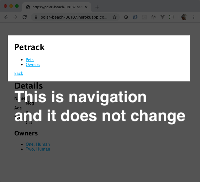
If you were working in Pug, that would be in your layout.pug because you would want it to appear in every page. In React, you will create a reusable component, maybe call it Navigation, and use it on all of your React-enabled pages.
This does one thing and one thing well: it shows the static content of the navigation. There’s nothing else it needs to do. Good job, Navigation component!
What this means is that the code that will create the heading “Petrack”, the links “Pets” and “Owners”, and the “Back” link will all be in their own component, which is just a JavaScript function or class. It could look something like this, but with real code where it reads “some cool React code here”. This is the skeleton of the code.
// Navigation.js
import React from 'react';

const Navigation = props => {
  /* some cool React code here */
}

export default Navigation;
You would put that in a file named Navigation.js. It’s capitalized because, in React world, the names of your custom components are always capitalized.
Don’t worry if that doesn’t make complete sense, yet. You will be making these components and their files for the rest of your lives. Or, at least, for the rest of this course. And, definitely, for the remainder of this module.
The walk through articles that follow this will explain what’s going on as well as what that props parameter is.
Now, for the remainder of the page.
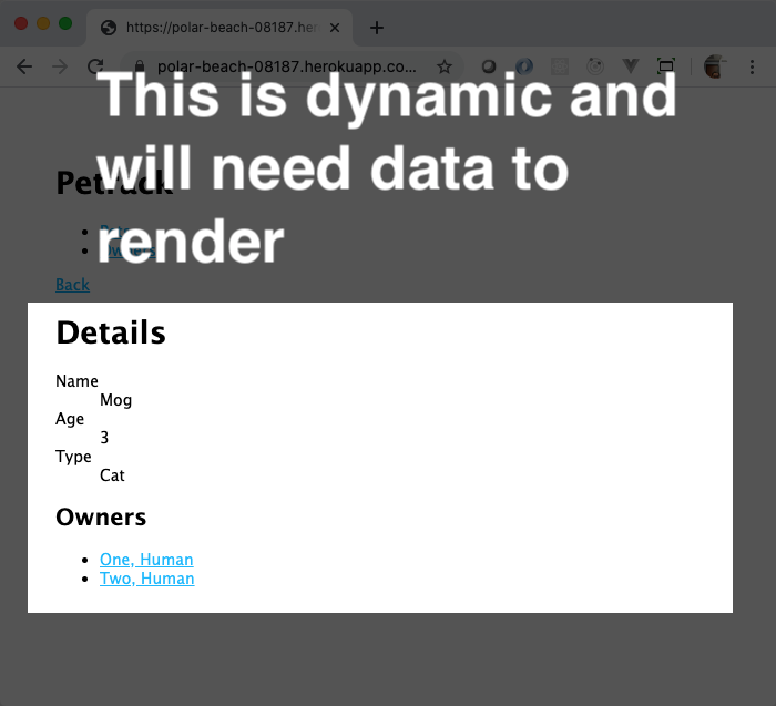
This could be another component. It would create the “Details” headline, show the individual details of the pet, create the “Owners” headline, and then create the links to the owners. It could look something like this.
// PetDetail.js
import React from 'react';

const PetDetail = props => {
  /* some cool React code here */
}

export default PetDetail;
This component, the PetDetail component, does too much. It’s in charge of showing two different kinds of information, the details of the pet and the owners links. That means there’s probably an opportunity to create more components that this component can then use. This is called component composition.
Now, please think like a Pug developer for just a moment. How would you create this page in Pug? The code for this from the project looks like this.
extends ../layout

block content
  h1 Details
  dl
    dt Name
    dd= pet.name
    dt Age
    dd= pet.age
    dt Type
    dd= pet.PetType.type

  h2 Owners
  ul
    each owner in pet.Owners
      li: a(href="/owners/" + owner.id) #{owner.lastName}, #{owner.firstName}
To start thinking in components, ask yourself
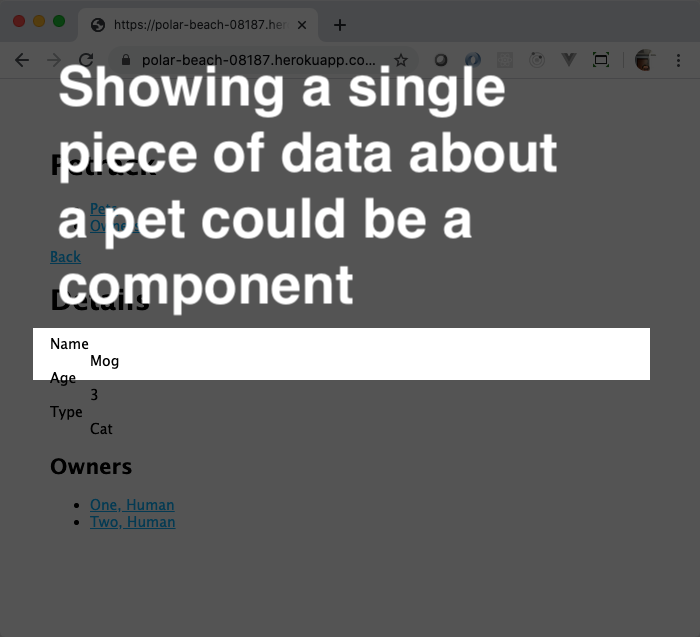
You can see that in the Details section of the page, there are repeated structures of dt and dd elements. You can see in the Owners section, there is a loop that creates a link to the owners based on the owner information. Those types of reusable chunks of content are good candidates for being their own components.
You can extract the creation of the dt and dd elements into its own component.
That could look something like this.
// PetInformationItem.js
import React from 'react';

const PetInformationItem = props => {
  /* some cool React code here */
}

export default PetInformationItem;
It would be responsible for making that portion of the Web page appear. And, you would use it over and over for each of the different pieces of data you wanted to show. As you add more data about pets, you could use that PetInformationItem to maintain the visual consistency of the Web page, as well as allowing you to write less code. This component does one thing and does it well.
Just like extracting the pet information item, you can extract that owner link into its own component. It would generate the the a and format the person’s name.
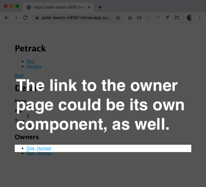
Again, the skeleton code would look something like this.
// OwnerLink.js
import React from 'react';

const OwnerLink = props => {
  /* some cool React code here */
}

export default OwnerLink;
This component also does one thing and does it well. If you ever need to change the way owner names appear in lists of links in the application, you can come to this one component and change it. It would then take effect everywhere! Single Responsibility Principle for the win!
Now, the thing that manages the list itself and the use of the OwnerLink component is eligible for being its own component, too.
It’s single responsibility is to manage creating the “Owners” header and the unordered list. It will use the OwnerLink component to do that! Again, this is called component composition.
// OwnersList.js
import OwnerLink from './OwnerLink';
import React from 'react';

const OwnersList = props => {
  /* some cool React code here */

  /**
   * Use the OwnerLink component, too!
   */
}

export default OwnersList;If you create the PetInformationItem and the OwnerLink component, then you will want to use them in your PetDetail component. That is as easy as using the import statement to allow them to be used by that code.
// PetDetail.js
import OwnersList from './OwnersList';
import PetInformationItem from './PetInformationItem';
import React from 'react';

const PetDetail = props => {
  /* some cool React code here */

  /**
   * Use the OwnersList and PetInformationItem
   * components, too!
   */
}

export default PetDetail;Once you have all of those components, you would create one more component, the top-level “page” component, that would render the Navigation and PetDetail components.
// PetDetailPage.js
import Navigation from './Navigation';
import PetDetail from './PetDetail';
import React from 'react';

const PetDetailPage = props => {
  /* some cool React code here */

  /**
   * Use the Navigation and PetDetail
   * components, too!
   */
}

export default PetDetailPage;
The final analysis in this breakdown of “components” to “think in React” looks like this.
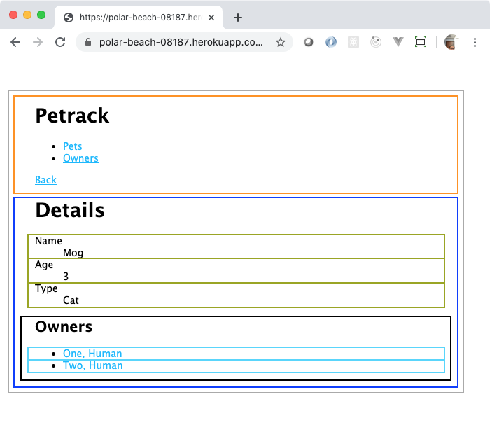
You can see each of the components that were described in this article. You can also see how the PetInformationItem and OwnerLink components get used multiple times on the page.
Take a look at this, again, and think about if there is any “missing” component before continuing.
You could also create a PetDetailList component, if you want, that would manage the “Details” header and the definition list. That would reflect the same structure that the OwnersList has, a component responsible for generating a header and a list. In the following walk through articles, the PetDetailList component will also be included in the development.
This is thinking in React. Looking at a Web page and deciding what parts of it belong in sections, what parts are repeated, and how to group them all together. The React documentation calls this breaking the UI into a component hierarchy. That link is to a section in the React documentation entitled Thinking in React. That section performs the same exercise that this article performed, but with a lot fewer words and pictures.
In the upcoming exercises, you will create these components in a couple of ways. The first way is the hard way, but shows you how React works under the covers. The second way uses the fancy JSX language to make it easier for you.