css into css : with use of the @import tag!
link HTML element.
The link element has to have the rel and href attributes configured like so:
Explain how CSS rules are applied based on their order and specificity, and be able to calculate the specificity of CSS rules and determine which rule override the properties of another.
IDs are unique, thus are considered highly specific since they always target one element.score specificity of selectors, and the one with the highest score is the most specific.in-line styling > id > pseudo-class selectors > class > tag name> means a direct child.space in between selectorscomma dileniated selectors (ex-> body, div, html {})See example from Monday’s code demo:
html:
css:
The not pseudo-class selector: html:
Only divs containing the text "Hello" and "Random" will have a background-color of red.
::before and ::after pseudo elements, & Use the content CSS property to define the content of an element:
See exerpt from W9D1 demo:
html: html <p> this is a paragraph tag</p>
css: css p::after { background-color: lightblue; border-right: 1px solid violet; content: ':-D'; margin-right: 4px; margin-left: 4px; }
font-size : size of lettersfont-weight : boldness of lettersfont-style : italicizationfont-family : actualy font
text-transform : text casingtext-decoration : underliningtext-align : text justification (left, right, etc.)color css property changes the color of the text.background-color css property does just what it saysrgb() - takes in 3 integer values denoting levels of red, green and bluergba() - Same as above but with additional argument (the ‘a’) called alpha which represents how transparent the color will be and is on a scale from 0 to 1 where 0 is transparent and 1 is opaque.Covering an element with a background image css #picture-here { background-image: url(https://appacademy.github.io/styleguide/assets/logo/logo-emblem-black-1000.png); background-size: cover; height: 100px; width: 100px; }
Explain why using Web fonts helps with consistent experience across viewing devices: -Your explanation here.`
rem - relative to rootem - relative to parentptpxcmdisplay property:
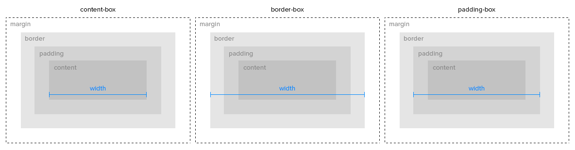
inlineinline-blockblockflexgridposition: fixed -position: relative - positioned relative to closest parent ancestorposition: absolute - removes from regular flow of the page.position: static - the default positioning of all elements.Identify elements rendered with specific padding and margin settings
Apply padding and margins to HTML elements to achieve a desired layout
Apply positioning settings to elements (fixed, relative, and absolute) to HTML elements to achieve a desired layout
fill infill inz-index : refers to the “third dimension” i.e. stacking elements on top of each other. a higher z-index means bringing the element to the top.justify-content
align-items
For the following LOs please revisit your project work and project solutions (i.e. AA Times, Wednesday EOD demo, etc.) for how you’ve done the following:
grow, shrink, and basis values.grow determines how much available space it will take upshrink determines how much the element can shrinkbasis is considered to be the default size of the elementflex-direction property to direct the layout of the content.flex-wrap property to affect the wrap of content layout within an element using flexible box layout.align-self, justify-content, and align-items to change the way that children elements are laid out in a flexible box layout.Use the order property to change the order in which elements will appear in a flexible box layout.
Use the grid-template-columns, grid-template-rows, and grid-template properties to specify the layout of the grid using relative and absolute measures.
Use grid-template-areas to label areas of a grid and grid-area to assign an element to the area.
Use grid-column-gap, grid-row-gap, and grid-gap to set the “gutter” areas between elements in a grid layout.
Use grid-column-start/grid-column-endand grid-row-start/grid-row-endto create spans across multiple columns and rows with positive integers, negative integers, and in conjunction with the “span” operator.
Use justify-items, align-items, justify-content and align-content to layout items in each grid area.
Use the order property to change the default order in which items are laid out
grid-column and grid-row to define how an element will span a grid layout
grid-column: grid-column-start / grid-column-endgrid-row: grid-row-start / grid-row-endgrid-area: grid-row-start / grid-column-start / grid-row-end / grid-column-endfr : fraction unit of measure used for creating grid layoutBlock, Element, and Modifier means in BEM
block__element--modifier element has n for underscore and modifier has d for dashtransition-property
transition-duration
transition-delay
transition
overflow: autooverflow: scrolloverflow: hiddenfetch in order to send a request to a specific route on our server, along with an options object to indicate the methods, headers, etc., that differ from the default values, a body with necessary data, etc...then on our call to fetch, which allowed us to then convert the response’s JSON into a usable POJO when the response came back. The data inside of this object is then accessible and used to manipulate the DOM.GET, PATCH, POST, and DELETE..then promise chains that we used in the project as well as how we could convert them into an async/await format: ```javascript // Using Promise chains for .then and .catch document.querySelector(‘#downvote’).addEventListener(‘click’, () => { fetch(‘http://localhost:3000/kitten/downvote’, { method: ‘PATCH’ }) .then(handleResponse) // handleResponse defined below for reference .then(updateImageScore) // updateImageScore defined below for reference .catch(handleError); // handleError defined below for reference });// Using async/await document.querySelector(‘#downvote’).addEventListener(‘click’, async () => { // Notice the async keyword on the callback definition! // We create a standard try/catch block try { // We await each asynchronous function call const resJSON = await fetch(‘http://localhost:3000/kitten/downvote’, { method: ‘PATCH’ }); const resObj = await handleResponse(resJSON); // updateImageScore is synchronous, so we do not have to await its response updateImageScore(resObj); } catch (e) { handleError(e) } });
// Functions used above, for reference const handleResponse = (response) => { stopLoader(); clearError();
if (!response.ok) {
    throw response;
}
return response.json();
};
const handleError = (error) => { if (error.json) { error.json().then((errorJSON) => { document.querySelector(‘.error’).innerHTML = Error occured: ${errorJSON.message}; }); } else { console.error(error); alert(‘Something went wrong. Please try again!’); } };
const updateImageScore = (data) => { const { score } = data; document.querySelector(‘.score’).innerHTML = score; }; ```